Learn > How to make a compelling business plan presentation (plus free templates)
Whether you’re a budding entrepreneur or have an idea for a new revenue stream within an existing corporation, you’re going to need a business plan.
A business plan is your route to securing investment and funding. It’s also a useful tool for you, clarifying what you want to achieve and how you plan to achieve it in high-def detail.
When it comes to persuading potential investors and stakeholders, you’ll need to condense your business plan into a business plan presentation. This will form a key part of your pitch.
(Cue long nights of stress and worry as you wonder what exactly you need to include to convince an audience that your business idea is destined for success — and worthy of their hard-earned cash.)
Great business plan presentations combine a brilliant business concept, data that proves potential and creative, clever slide design.
The first two are down to you. But luckily, we can teach you all the design tricks you need to achieve the latter. Bring those key components together and you boost your chances of getting the investment or stakeholder approval you need to pursue your ambitions.
Read on to learn what great design can do for you and how you can incorporate it into each of the essential business plan slides you’ll want to include in your presentation.

A business plan presentation forms part of your investment pitch. It’s a summary of all the information included in your (probably very lengthy) business plan document.
Whilst the document dives deep into business details, your business plan presentation provides an overview (with you on hand to flesh things out a little).
It should tell an audience about your business and the products or services it offers. It has to detail where you’re planning to take your business and how you’re planning to get there.
A business plan presentation should also outline those all-important figures; what will you do with investment and what do investors or stakeholders stand to gain?
That’s a lot to fit onto just a few slides! But — as we’ll discover — it’s important to communicate your business ideas as clearly and concisely as you possibly can.
Whilst you have to know your entire business plan inside out (and be prepared to expand on points if investors and stakeholders have questions), the presentation is an opportunity to highlight need-to-know informational nuggets.
Aim to give investors just enough info to spark their interest and see your potential, without overloading them with the finer details.

A good business plan presentation is all about the facts and figures, right?
Let’s be honest. You won’t get very far without a great business idea and numbers proving its profitability. But forgetting about business plan presentation design is a huge mistake.
Bad design can hamper your message and investors’ confidence in your abilities. A visually confused presentation can’t help but leave a bad impression.
Good presentation design, on the other hand, can help you to communicate your ideas more effectively. It will help you to maximize the potential of every slide, saying more without cramming in tons of text.
It will also help you to engage your audience from the very start.
Some investors sit through lots of pitch presentations. Yours should grab their attention. It should assure them of your professionalism and capability. And it should stick in their memory for all the right reasons.
Good presentation design can help you to achieve all of the above.
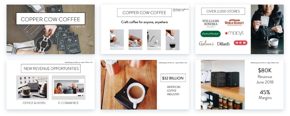
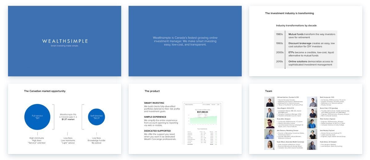
The perfect business plan presentation should fit into 10 slides — 20 at the absolute most. It should take no longer than 20 minutes to deliver. But, what should be included? Here, we’ve listed the key contents that investors care about the most:
Also, if you’re pitching to a number of different groups, you may want to adapt your presentation as you go, adding in slides in response to commonly asked investor questions.
But start by keeping things short, sweet and digestible as per the structure below. And don’t forget to maximize the potential of each business plan slide by giving careful thought to design.
Cover slides are too often an afterthought. But this first slide has so much potential.
Your cover slide is your first impression. And — as we know — first impressions count. Especially when you have limited time in which to convey what you and your business are all about.
A cover page should include your company logo and (if you have one) your slogan. It should also feature a title that summarizes your offering.
This slide won’t be information-heavy, but with the right design it can communicate a lot about you and your business.
Cover slide design sets the scene. It’s an introduction to you — a professional who takes every aspect of their business very seriously. And it should hook your audience from the very start.

Pick a visually appealing font and layout. Start with a cohesive design you can stick to for the rest of the presentation.
Corporate presentations in blue tones have been seen many, many times before. So when it comes to colors, try to stand out from the crowd. Pick strong but complementary shades, without going too garish or OTT.
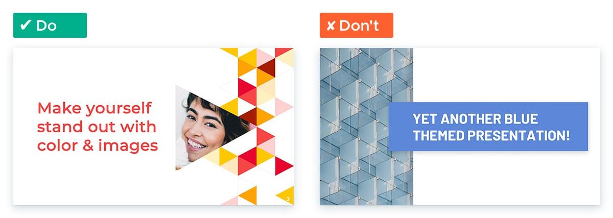
Also, go big and emotional with images. Images provoke an emotional reaction in an audience that just isn’t possible with text alone.
So give center stage to an image that reflects what your business wants to achieve for its customers. You’ll draw your audience in with design, ready to hit them with business plan facts and figures.
What problem will your business solve? An audience needs to understand the full extent of this problem before you tell them how you plan to solve it.
So use this slide to explain why this pain point exists, how many people experience it and what it feels like to experience it.
Facts will convince your audience whilst good storytelling will appeal to their emotions too.
Color here is really important. With it, you can associate your brand with the solution rather than the problem.
Pick a color that contrasts with those used in your business branding. Then use this color to present the problem.

If you’re struggling to pick the right contrast, take a look at the color wheel. Find your primary brand color. Then pick a contrast in the other half of the wheel, avoiding the one directly opposite.
When presenting figures, pick three or four impactful numbers and put them in a BIG font. You’ll surprise your audience with both the content and appearance of your slide, emphasizing the size of the problem in the process.
Your audience understands the problem. Now it’s time to tell them the solution you envisage.
Keeping things simple will create more impact. Diagrams, sketches or just a single sentence will make your solution digestible and memorable.
Back to brand colors with this slide! This will create a link between your brand and the ingenious solution in the mind of your audience.
Creating the right emotion is also really important here. Get your audience to feel something and your solution is much more likely to stick in their memory.
Color and image are key to emotional design. They provoke immediate and largely subconscious responses in an audience. So think carefully about the visuals you include on this slide.
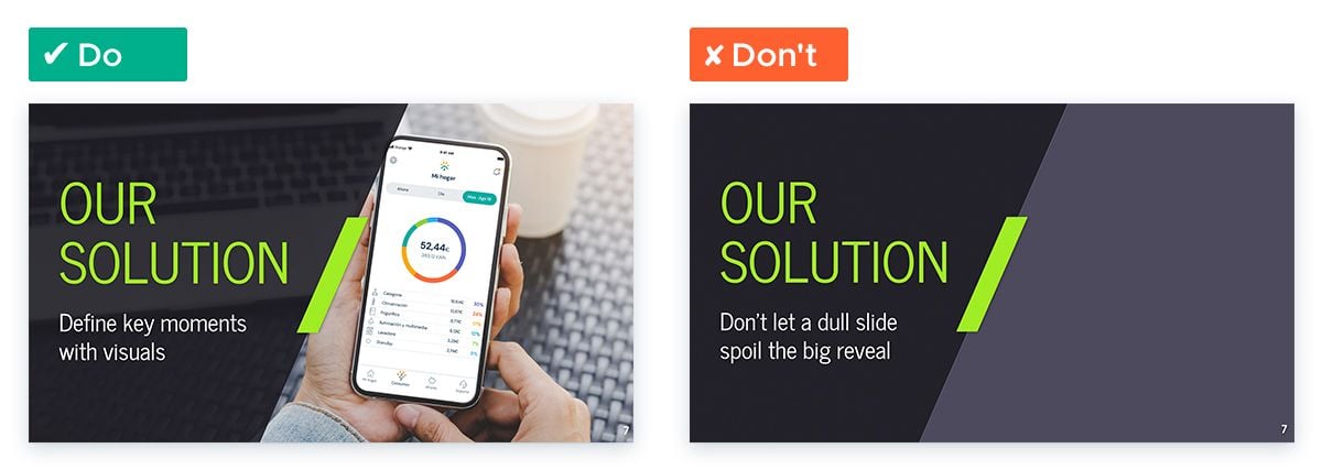
As human beings, we’re instantly drawn to faces. So you could use photos of people looking happy and content along with a calming color scheme to communicate a sense of positivity.
Do it right and your audience will associate those feelings with your brand and your solution.
Your idea might sound great. But unless you have proof that your proposed market is actually interested in it, you won’t convince investors.
Use this slide to describe your market and your business niche within it. Give evidence of customer interest in your product and service, providing data that demonstrates the market size and potential growth too.
Video is a great way to showcase the opinions of your prospective customer base. So embed some short and snappy video interviews into your slide. Plus, it will give you a break from doing all the talking too!
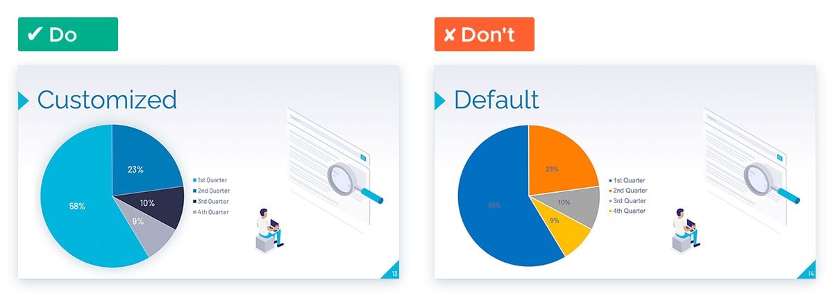
When it comes to showing market data, take some time to think about your chart design. All charts should fit with the color scheme of your business plan presentation. Leaving your charts unedited is amateurish and a huge design no-no.
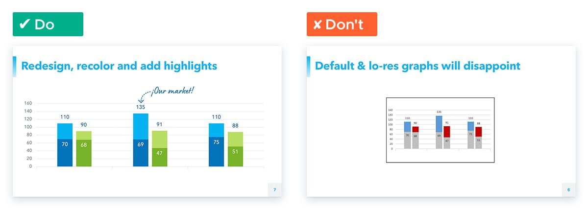
Also consider what exactly it is you’re trying to say with this data. You can then use color along with other data storytelling techniques to really highlight the important numbers and keep an audience’s attention where you want it.
Who are you up against when it comes to solving this problem and winning over your prospective customers?
Your investors will want to know all about your competition and what you plan to do differently. This slide should show how your customers are currently handling the problem you plan to solve and how alternative solutions compare with yours.
You can be a little sneaky with this slide. Use design to show your competitors in a less favorable light than your own brand.
That could mean displaying their logos in black and white and yours in full color. If you’re using a competitive matrix chart, you could use the most appealing color to represent your company.
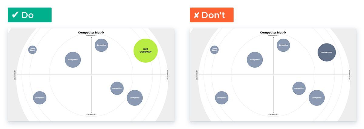
And if you want to show screenshots or images of competitor products, opt for the least attractive ones you can find, remembering all the while that your competitors will be doing exactly the same thing to you one day!
This is where you tell your investors just how you are going to make money — and grow theirs in the process. Solid numbers are the only way to win your audience over.
You should show the cost of customer acquisition and their lifetime value. Financial projections for the years to come, featuring cash flow, burn rate and break-even point are another essential.
Also be clear on what your investors stand to gain and when they can cash out. They’ll only ever be interested in your product and how it helps your audience if it also boosts their bottom line.
This is one slide where balancing depth of content and audience engagement is really important — and a little bit tricky.
There’s probably lots of info you want to communicate to your audience at this point. Try to keep it simple (but not so simple that your investors don’t have enough data to go off).
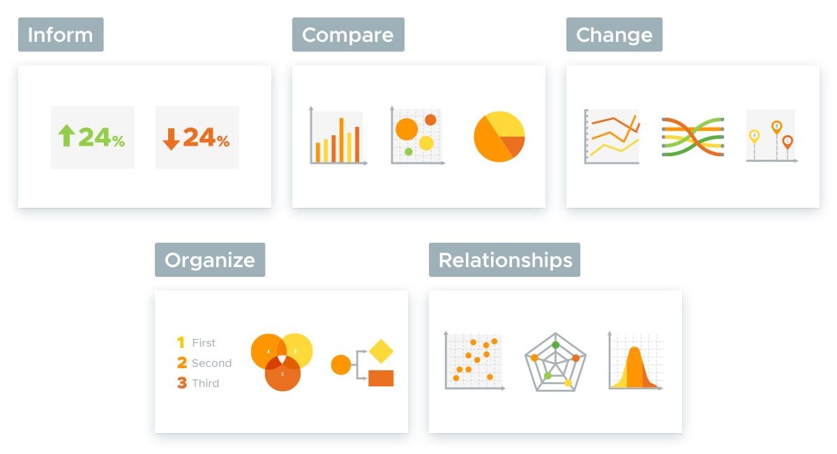
This means making the most of every chart. Play around with different charts until you find one that displays your data as simply as possible. Your audience should be able to process the figures at a glance.
And don’t forget to customize! Highlights, color and great data storytelling will help you to convey your numbers clearly and legibly.
What is the business but the team behind it? Investors often want to get a sense of the great minds running your brand.
This slide is an opportunity to introduce them to the management team (and give a sense of their competence and dedication to the task at hand).
Provide brief bios (no life stories here please!) and work to paint a picture of expertise in as little time as possible.
Concise bios and professional headshots are a must. If possible, take photos of team members in the same session so lighting and location are consistent.
Professional photography gear isn’t essential. Smartphone cameras have pretty good capabilities these days.

But, whatever you do, don’t leave it to the last minute. You’ll end up with the pics your team have had on their Twitter profile since 2014, which definitely won’t fill your investors with the required confidence.
So, your investors are prepared to cough up the cash you’re looking for. How much do you need and what will you do with it?
This slide is a place to list your goals, and demonstrate how you’ll reach profitability (or a next round of funding) with the money your investors are putting up.
Remember earlier, when we talked about emphasizing the size of the problem faced by your market by putting figures in a BIG FONT?
Don’t scare your investors by doing the same thing here!
When you’re asking for money, keep fonts to a reasonable size. Also use calming colors, avoiding exciting reds and yellows wherever possible. You don’t want heart rates racing at the sight of those dollar signs.
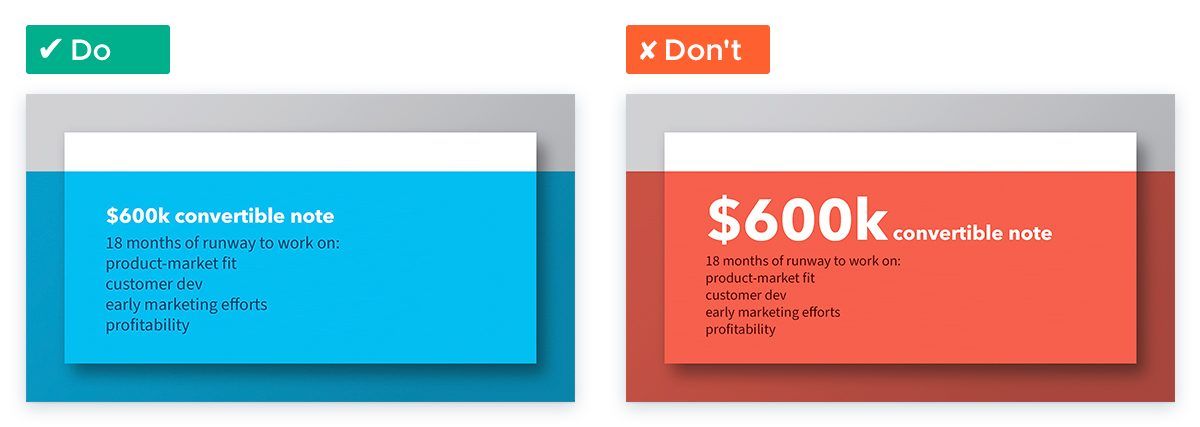
Logically presenting your goals is important too. The more logical your layout, the more manageable and realistic your goals will seem.
Try presenting your goals in columns, rather than in bullet points. And then use icons to illustrate your points and reinforce your message.
Just like your title slide, your conclusion should be given the same thought and attention as all the rest. End on a high note with a short but inspirational recap.
And don’t forget your contact details too!
We’d recommend fading to a dark slide background here. That way, all attention focuses on you.
With a simple, minimalist slide design, you and your closing statements take center stage. Pick the right words and this style of presentation conclusion can leave a lasting impact on your audience.
Getting ready to pitch your business idea to investors is stressful enough, without having to worry about presentation design.
If visuals aren’t your forte, leave it to the graphic design experts at Slides Carnival and choose from one of our free business plan templates.
These templates all include a business timeline, roadmap, SWOT analysis, competitor analysis and lots of other really useful business plan key elements and visuals. Use them to add credibility to your content and convince investors and stakeholders that you’re a risk worth taking.


Professional designs for your presentations
SlidesCarnival templates have all the elements you need to effectively communicate your message and impress your audience.
Suitable for PowerPoint and Google Slides
Download your presentation as a PowerPoint template or use it online as a Google Slides theme. 100% free, no registration or download limits.